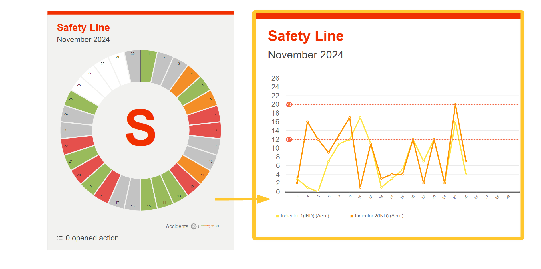
The QCD chart provides a graphical representation of the values and thresholds of the indicators entered in the boxes of a letter. The tool scans a defined letter and generates charts based on the configuration made.
This article explains how to access and use the QCD chart tool to optimize your analyses and action plans.
Accessing the QCD Chart
This tool is present by defaut in your board’s dock, as are the other QCD elements.
Using the QCD Chart
To use the QCD chart:
Drag and drop it onto the board.
Start configuring it:
.png)
Select the letter for which you want to generate a chart.
From the Configuration button, you can:
.png)
select the data visualization type:
Short-term data visualization
If you select this data visualization type, the values of the current time window are used.
Long-term data visualization
If you select this data visualization type, the values are taken from a series of time windows (from… to…)
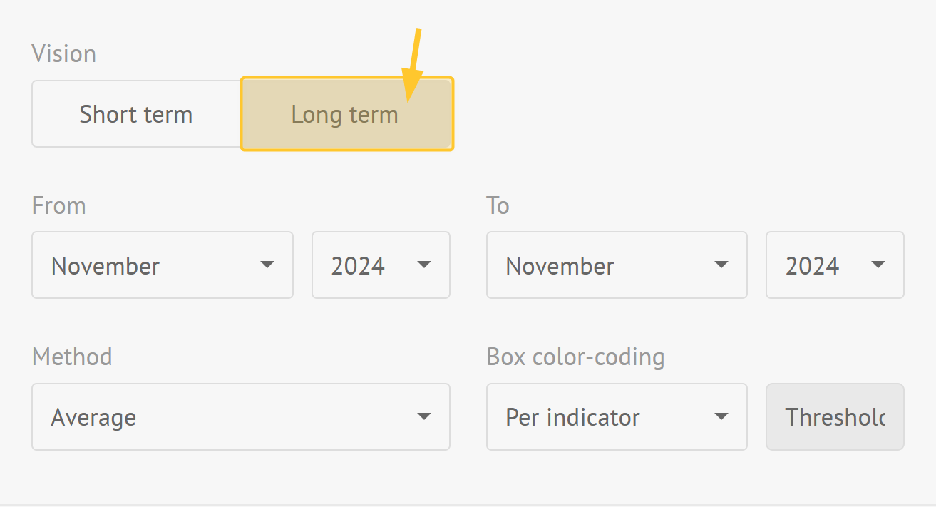
You can define:
beginning and end of long-term time windows:
Note:
The selectors depend on the time window of the board.
indicator type of consolidation: sum or average or maximum or minimum
box color-coding (threshold visualization): per indicator or global
Note:
Long-term shows values from the letter historical data by aggregating them according to the selected option.
enter a desription that is displayed at the top right of the item.
Click Save to proceed to the next step.
Select the indicators to display, ring by ring.
Note:
If an indicator is present on several rings, colors derived from the indicator color are generated.
Manage the display of these indicators in different ways via the aggregation method:
“None” option displays a series of data (values and thresholds) by ring. Values from the first ring keep their original indicator colors. Values from other rings are given a color derived from their indicator's original color.
“Sum”, “Average”, “Min” and “Max” value aggregation options display only one series of data per indicator, with a dot for the corresponding threshold.
Define chart layout.
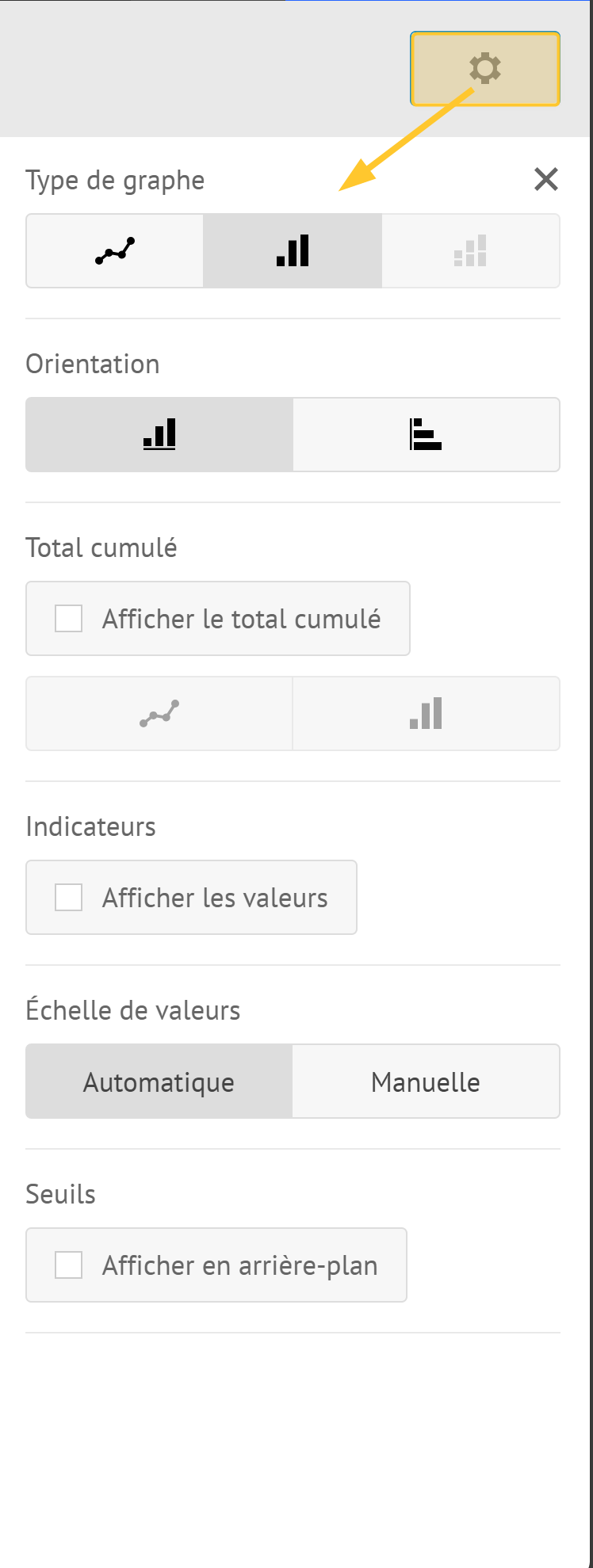
The Settings button allows to define:
chart type:
line chart
bar chart
stacked bar chart
chart orientation:
vertical
horizontal
whether or not to display cumulated values under the form of line or bars.
whether or not to display the values.
vertical axis minimum and maximum values.
Note:
By default, they are automatically adapted to represented values.
whether or not to display thresholds in the background.
Note:
You can use this feature to track a single indicator.
Tip:
You can use this feature to track an indicator present on several rings.
Click Save.
Your chart is ready to be used.
Note:
When you modify the letter, the information is automatically updated in the chart.
Warning:
You cannot generate a graph with indicators belonging to concentric rings with:
different number of boxes (different ritual frequencies or different numbers of boxes in a custom cut-out).
different labels (in case of a custom cut-out).
Binary indicators values can be either:
0 (if you choose the left label)
1 (if you choose the right label)